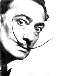
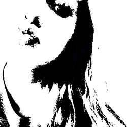
1. We had to make him look like he was drawn/sketched in by using different filters.
2. I used color by making it black and white and I used tone/value by adding the shadows.
3. I used emphasis by using the shadows and colors to emphasize certain things. I used unity by making the entire thing black and white and have the same color scheme.
4. I used filters, layers, and highlights with the pen tool.
5. This was successful because I correctly followed the directions and it turned out well.
derrick rose
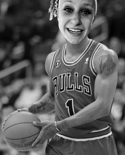
1. This was my surrealism portrait project.
2. I used color by taking out all of the color and making it black and white and I used tone/value by making the shadows match up.
3. I used proportion by making all of the body parts match up and I used balance by making sure that the whole thing looked cohesive.
4. I needed to use the pen tool, the color wheel, and layers.
5. This project was successful because it made me
portrait 2
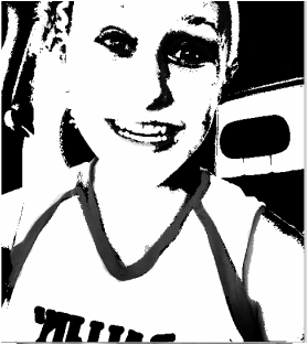
1. The idea for this project was to change your self portrait into a certain style of art (in this case pop art).
2. I used color by taking away all of the color from this picture and I used tone/value by adding the shadows/tints.
3. I used unity by making all of it work together and I used balance by making the colors look even on each side.
4. I used the gradient tool, the pen tool, and the adjustment layers.
5. This project was successful because i had fun doing it and i enjoyed using pop art as my inspiration.
comic
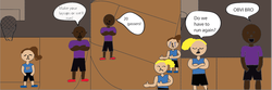
1. The instructions for this project were to create a comic about your high school life.
2. I used line when I drew the figures and I used color by using the bucket to color it in.
3. I used proportion by making everyone in their respective proportions and I used balance by spreading out the characters and making the scene appealing to the eye.
4. I used the pen tool, the paint bucket, and the paint brush.
5. This project was successful because it really represents what every practice was like and it was fun to make.
portrait 1
1. The project description was to make a pop art version of yourself.
2. I used color by taking away the color and making it black and white, and i used texture by making it look more grainy.
3. I used emphasis by deciding where I want the darkest colors to be and I used rhythm by making all of the pixels flow together.
4. I used the different layers, different gradients, and adjustments to the layers.
5. I like this project because it was fun and different and I really enjoy pop art.
color adjustment
1. The point of this project was the change the colors of certain things by using the lasso tool.
2. I used color by changing the colors and I used tone/value by keeping a consistent value.
3. I used proportion and rhythm by keeping a color scheme going.
4. I used the color wheel, lasso tool, and layers.
5. I learned more about how to use the lasso tool to change the color of things.
2. I used color by changing the colors and I used tone/value by keeping a consistent value.
3. I used proportion and rhythm by keeping a color scheme going.
4. I used the color wheel, lasso tool, and layers.
5. I learned more about how to use the lasso tool to change the color of things.
dr. seuss
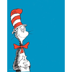
1. We had to erase the words for the title of The Cat in the Hat and make it look as if they'd never been there.
2. I used color by keeping all of the blue background color the same and i used texture by making sure that all of the texture for the background was all smooth and was the same.
3. I used unity to make it all look as if there never were words, it flows well. I used balance by making sure that there weren't different shades of the blue, they were all the same.
4. I used the clone stamp, layers, and the healing stamp.
5. I learned how to use the healing stamp and how to make it all look cohesive.
tattoo removal project
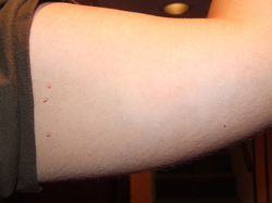
1. The project description was to erase the tattoo from the arm that we were given.
2. I used texture by making the arm still look life-like with its skin-like texture. I used tone/value to make sure that I kept the correct shadows with it.
3. I used unity to make all of the skin on the arm look the same and look natural. I used balance by keeping the continuity of the color of the arm the same and make it all look balanced.
4. I used the clone stamp, layers, and color.
5. I learned about the clone stamp tool and how to use it.
Final teeshirt project
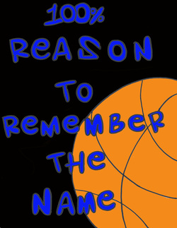
1. My personal objectives for this project were to make something that represents what I'm passionate about.
2. Two elements of art I used are color because I used Santa Teresa's colors on purpose and I used space by the way I spaced the letters.
3. I used proportion by not making some letters too big and I also used balance by making the colors work together.
4. I used the pen tool to fix my letters, I used to color bucket to color everything in, and originally this was a drawing that I scanned into Photoshop.
5. This project was successful for me because it showed basketball, something I'm really passionate about. It also incorporated lyrics from one of my favorite basketball warmup songs.
Color wheel of shoes
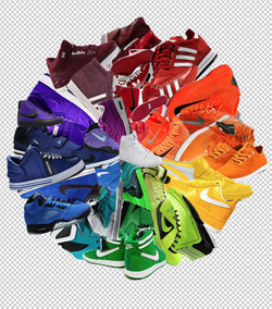
1. The project description was to create a color wheel and use the color techiques we were given.
2. I used space by the way I was able to fit all of the different shoes and I used color by making the outer shoes darker than the inner shoes.
3. I used rhythm by making them all look somewhat alike and I used unity by making them overlap and flow into one.
4. I needed the pen tool to cut out each shoe. I needed the Free Transform tool to size the shoes. I needed to use my different layers to get the layering of each color just right.
5. This project was successful for me because I really liked the way it turned out and I'm proud of how much work i put into this.
shapes and value
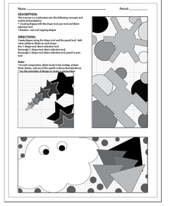
This project was using shapes to create interesting compositions.
I used value and space. I made sure to space out the shapes equally or so that they looked like a cohesive composition, and I used different values of grey/black.
I used emphasis by using different colors and layering thing. I used contrast by the way I used the colors.
I used the shape tool, the color tool, and pathfinder.
I learned about how to overlap shapes and to combine them using pathfinder.
typography practice
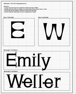
This project was to practice designing type or typography.
I used line and size. I made the letters the right shape to each other and used the same sort of line.
I used proportion by making the letters look well together and used emphasis by adding serifs.
I used the pen tool, the grid in the background, and the fill in tool.
This project was successful for me because i really enjoy typography and being creative like this.
derrick rose, strong
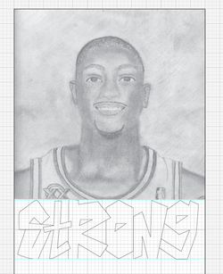
This project was to take the picture you'd done before but also combine it with a word you'd made yourself that described the person.
I used line and shape. I made the letters were rigid and straight lined.
I used proportion by making the letters the same size and proportional to each other and i used balance by making them all within the same theme.
I used line, the grid in the background, and shapes.
I loved this project because i really enjoy typography and i got to incorporate it my favorite basketball player into it.
pattern within lines
This project was to fill in the line patterns i'd created before.
I used shapes and value. I added shapes like spirals between the line and value to the shapes i added.
I used balance and emphasis. I emphasized the patterns i liked most by making them darker and i used balance by using symmetry.
I used the line tool, shape tool, and color tool.
I learned about balancing things out.
east side union high school logo
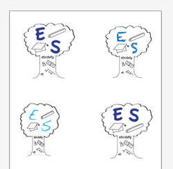
This project was to design a logo for our high school district.
I used color and line. I used different shades of blue to see which one I liked the best and I used line to create the outline of the tree.
I used proportion, so that the trunk wasn't too small or too big, and i used emphasis by only making the letters colored so that they stick out more.
I used the color tool, pen tool, and type tool.
I learned about logos and what is important in them. I enjoyed this project because i was able to do whatever i wanted within the needed requirements.
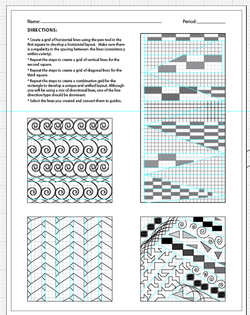
line patterns
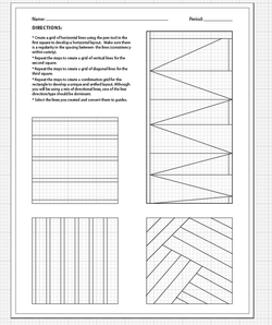
This project was to make patterns out of lines.
I used size and line. I made these lines certain sizes or lengths to create my composition.
I used balance and pattern. The idea of the project was to use pattern, and i had to balance it out so that it didn't look unorganized.
I used the pen tool, direct selection tool, and i used the grid to space out my lines.
It was successful for me because i had a good time doing it and i like the way it turned out. It's simple and clean.
line practice
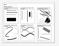
This project was to try out the many different ways you can use the pen tool in Adobe Illustrator.
I used line (obviously) and I used space. I didn't just stick all of my lines in one part of the page, I spaced them out.
I used pattern and gradient. Pattern by how I arranged the same sort of line, and gradient by using the different shades of the lines.
I needed to know how to use the pen tool to make straight lines. I learned how to make a zig zagged line and also how to change the thickness of the lines.
I learned about the different tools regarding to lines on Illustrator.
derrick rose
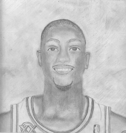
This project was to draw a picture of someone you idolize/look up to using a grid. I drew Derrick Rose, point guard for the Chicago Bulls.
I used line and value. I needed to know where to put a strong line and where to put a light one. I used lots of value skills and shaded a lot.
I used proportion (which is very important if you're drawing a person) and I also used balance.
It wasn't done in Illustrator.
It was successful for me because I really enjoyed doing it, it was fun for me.
Shapes, structured
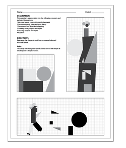
This project is much like the last one but not as fun, it is more just straight up and down and strictly structured.
I used shape and space. i spaced things out in a certain way and i used circles, triangles, squares, and rectangles.
I used pattern and gradient. The colors of the shapes are in the grey scale and pattern because I consistently used the same shapes.
You need to know how to make shapes, move shapes with the direct selection tool, and change the color/value.
I learned the ways around Illustrator.
Shapes, free for all
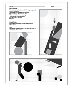
This project was to practice with shapes and get used to Illustrator.
I used shapes and value in the composition.
I used proportion and gradient as my elements. I purposefully used incorrect proportion, though. It gives it a fun and goofy vibe.
You need to know how to use shapes, color, and the direct selection tool.
This project was successful for me because it let me be creative with not too strict of a structure for design.
